Light lengthens the day and allows us more time to learn, socialize, contemplate and create.
Exploring NASA nighttime satellite images shows how illumination patterns have changed over time. Increases and decreases in illumination show the effects of human civilization on earth. From population collapse and destruction in war zones to economic growth and the beneficial use of technology in other areas, it's all reflected in our nighttime sky.
The NASA Visible Earth team recently released a new set of satellite images, making it possible to compare changes in illumination between 2012 and 2016.

So what can nighttime illumination tell us? While there are many reasons for increases and decreases in nighttime light, the most common causes follow.
Causes for decreased nighttime illumination:
- Technology advances focused on energy conservation.
- War or natural disaster resulting in the destruction of urban infrastructure.
- Mass emigration and population collapse due to social or economic tragedy.
Causes for increased nighttime illumination:
- Population growth.
- Increased economic activity.
- Improved standard of living.
Accessing the NASA data
Satellite imagery is provided in JPEG/TIFF format. In order for SAS Visual Analytics to process this data, I needed to convert the images into data sets. First, I downloaded the high resolution images for both 2012 and 2016. NASA also provides a 500m resolution versions if required.
Image processing
While you could use any image processing tool including the CAS Image action in SAS Viya, I decided to use Esri's ArcMap desktop tool to process the images and apply geo referencing. For the analysis, I'm looking at pixel changes between the 2012 and 2016 images. The Esri minus-tool (for spatial analysis) lets me calculate these differences and indicates illumination increases in positive color values.
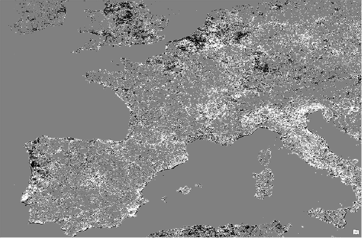
The resulting raster image has color values between 0 and 255 and will show related changes in either negative or positive values, indicating either decrease or increase in light illumination.
For better differentiation I also applied color classification using ArcMap. This lets you quickly see increase or decrease given a color palette. The following screenshot shows the area around Rome, Italy and related illumination increases in orange/red cells as well as decreases in green:
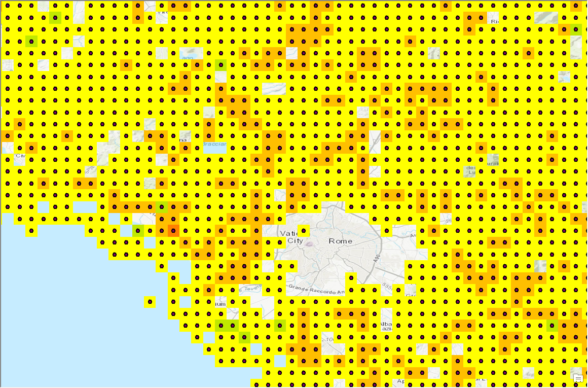
Note, I also applied a transparent color to cells without illumination change. This explains the missing cells in the the city center which is just as bright in 2016 as it was in 2012.
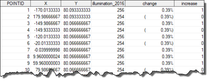
For easier processing in SAS Visual Analytics I also decided to convert the final raster image into individual data points using the Raster To Point tool (Conversion Tools). This allows me to export the data into an Esri shape file.
All of this work was done in ArcMap.
Importing data into SAS
Shape files can be imported into SAS using the related 'proc import' statement.
proc mapimport datafile="blackmarblepoints.shp" out=work.blackmarblepoints;
id pointid;
run;
The resulting SAS data set has more than 3 million data points and individual attributes showing total 2016 illumination as well as the change (percentage) compared to 2012.
City enrichment
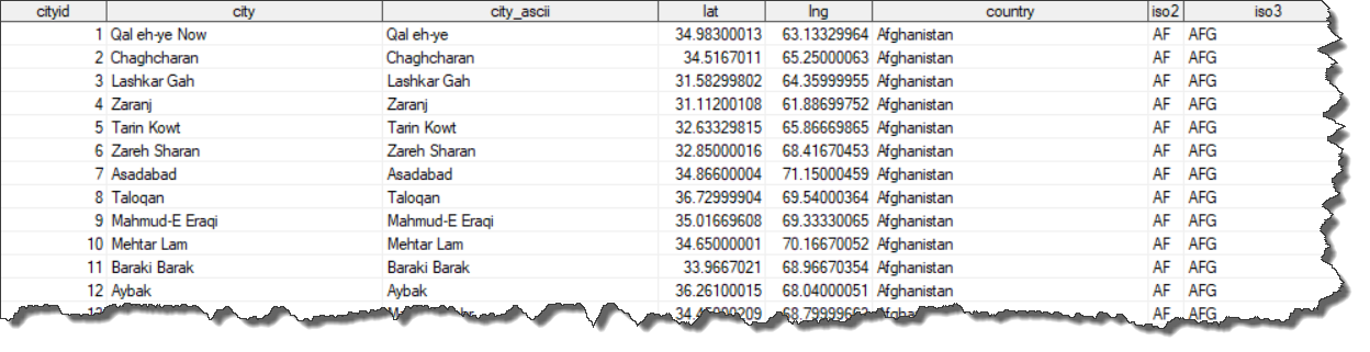
The previously imported data source contains individual data points indicating illumination changes across the globe. To make the analysis more interesting, I'm also merging in location information including cities, states and countries. Using world city lists such as the World Cities Database along with SAS functions such as geodist make this a very straightforward process. The city data base comes in a CSV file and the import is done via:
proc import datafile="worldcities.csv" out=work.world_cities dbms=csv replace;
  getnames=yes;
  guessingrows=max;
run;
I used a SAS data step to calculate the distance between the points and any given city. I decide to store the closest city id for any given point:
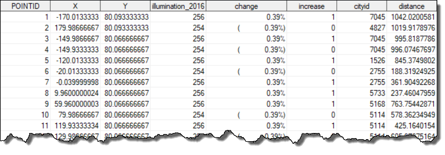
In the visual exploration and analysis later, I'll assume a city 10 miles or closer from a point contributed to the illumination change.
Analysis for illumination data
We can now use SAS to analyze and build interesting visualizations around global nighttime illumination changes. To better understand the data, I started off with a simple histogram giving an indication about the distribution of change values:
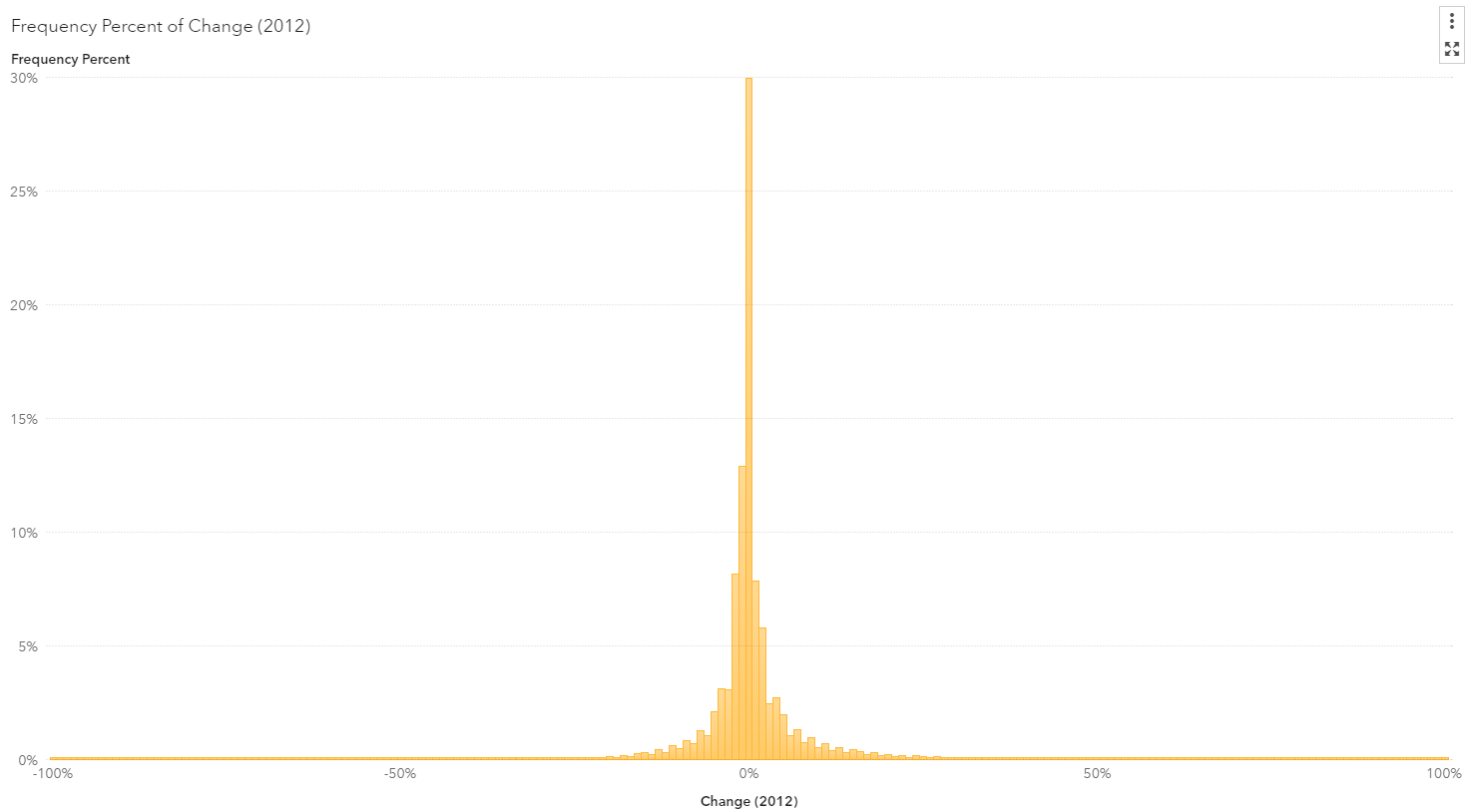
As expected, most areas around the world did not change much or only changed minimally. However, there are areas with significant change as indicated by the smaller bins. Let's explore further.
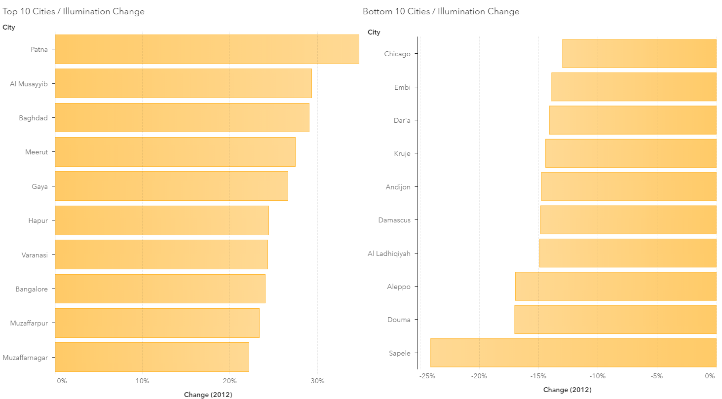
The following bar charts show a top and bottom city ranking given their change in lighting. Interestingly, some cities show a change of more than 20 percent in illumination compared to 2012:
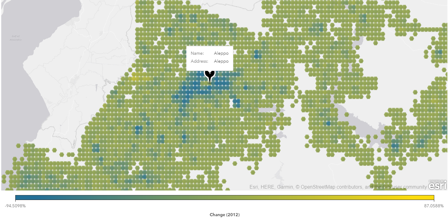
Given each data point is geo referenced, we can configure a point as a geographical item in SAS Visual Analytics, and use a geo visualization to render areas of interest.
Interestingly, though not surprisingly, cities such as Aleppo (Syria) effected by devastating war have lost a lot of nighttime illumination. Sadly, some areas have no nighttime lights left at all.
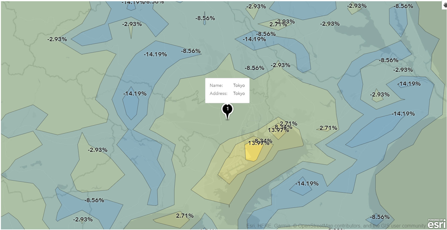
What about mega cities such as Tokyo, Japan? It seems Tokyo increased in illumination more than 10 percent from 2012 to 2016, and a detailed contour plot of just this area shows the increase in just some specific parts of the city:
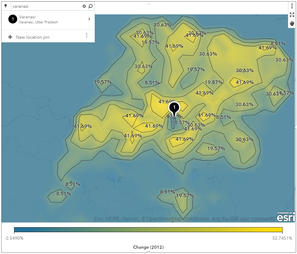
Countries such as India have gained illumination due to economic growth and improvements in electrical delivery and roads. At the top of the ranking in increased illumination is the city of Varanasi, and the following contour plot shows the areal illumination change.
In contrast, countries such as North Korea still remain in the dark, unchanged since 2012:
Final report
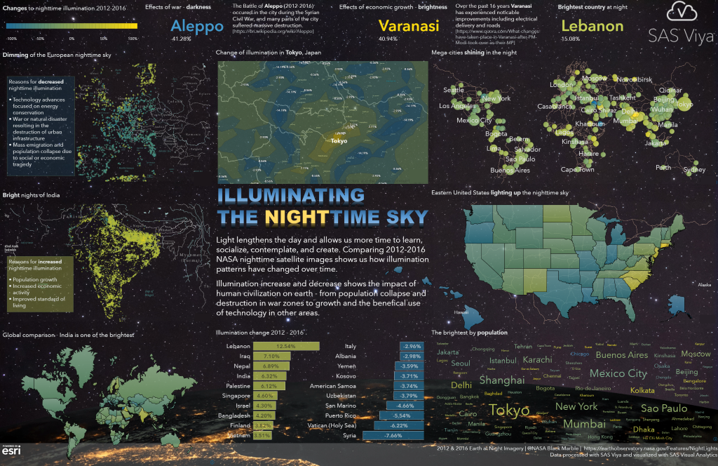
SAS Visual Analytics supports a rich set of layout tools and styling. As I've show in previous posts about designing infographics, we can now merge all visualizations into a single infographic poster. As part of the report design, I decided to use additional background images and special header styling. The final report renders as follows:
A high resolution version of the poster can be viewed here (2891x1875, PNG, ~7MB).
Conclusion
SAS Visual Analytics provides a wide range of tools to create modern data visualizations and infographics. Analyzing unusual data sources such as satellite imagery helps to understand human behavior and the impact we have on earth.
References:
2012, 2016 Earth at Night Imagery, NASA Black Marble, https://earthobservatory.nasa.gov/Features/NightLights, Downloaded May 22nd 2018
